Type Quote by Stephen Coles
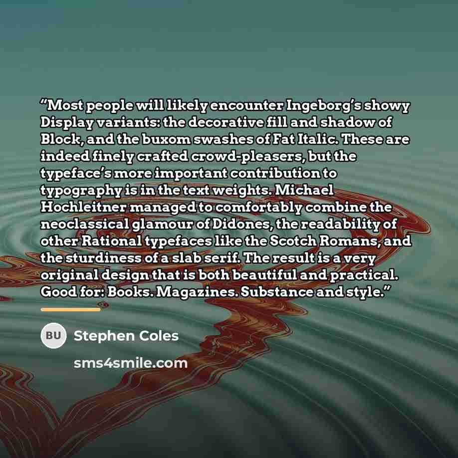
““Most people will likely encounter Ingeborg’s showy Display variants: the decorative fill and shadow of Block, and the buxom swashes of Fat Italic. These are indeed finely crafted crowd-pleasers, but the typeface’s more important contribution to typography is in the text weights. Michael Hochleitner managed to comfortably combine the neoclassical glamour of Didones, the readability of other Rational typefaces like the Scotch Romans, and the sturdiness of a slab serif. The result is a very original design that is both beautiful and practical. Good for: Books. Magazines. Substance and style.””
About This Quote
Source Article: Typography Review, 2020
The value of a typeface lies more in its weight variations than decorative flourishes, balancing beauty and practicality.
In simple terms: Weight matters more than decoration.
Key Takeaway
Choose fonts for readability and versatility.
Themes
typography
design
functionality
Mood
analytical
professional
Type
critical
educational
When to use this quote
- branding
- editorial design
- digital interfaces
Key Concepts
visual hierarchy
readability
aesthetic balance
Questions to Reflect On
- How do you prioritize function over form?
- When is decorative typography appropriate?
A Different Perspective
Overemphasis on style can hinder legibility.





![“He [ the son]'s grown up listening to all types of music, and the natural form of rebellion is to find the one genre that maybe he hasn't listened to and to make that his thing.” quote by Solange Knowles](https://sms4smile.com/quotes/img-quotes/401/solange-knowles-13288_form_he-the-son-s-grown-up-listening-to-all-t_4963.jpg)