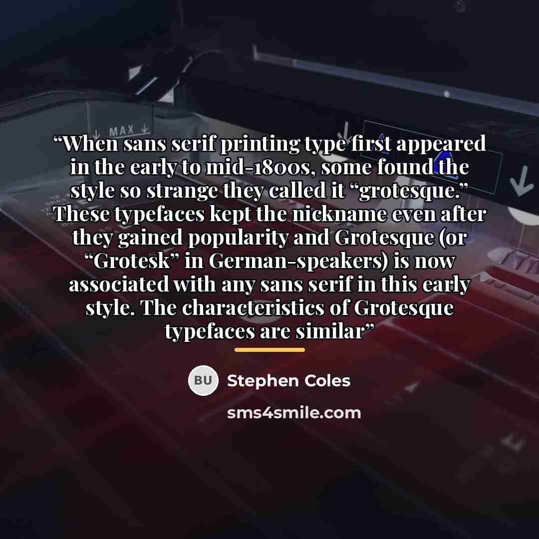
Type Quote by Stephen Coles
““Bell Centennial’s bizarre “4” and “M” are a perfect lesson in type made specifically for its intended medium. In this case, the platform was telephone books. In 1974, AT&T asked Matthew Carter to replace their previous typeface, Bell Gothic, with something that could save costs by fitting more lines per page. To keep the type legible at tiny sizes on cheap paper, Carter made extensive use of a compensation technique called “ink trapping.” This reduces the amount of ink-spread that distorts letters by filling junctions and counters. So, what looks strange, even ugly, at large sizes, actually takes its proper form on the pulpy pages of a directory. Many capitalize on Bell Centennial’s curiosity to set eye-catching””
About This Quote
Source Article: “The Story of Bell Centennial” by Stephen Coles, 2022
Bell Centennial was designed for telephone directories, using ink trapping to stay legible at tiny sizes, even if it looks odd at larger scales.
In simple terms: A typeface can be ugly big but perfect small due to its intended use.
Key Takeaway
Design for context, not just aesthetics.
Themes
design
typography
functionality
context
legibility
Mood
analytical
pragmatic
Type
informative
technical
When to use this quote
- telephone directories
- small print
- branding
- graphic design
- printing
Key Concepts
ink trapping
type adaptation
medium specificity
Questions to Reflect On
- How does medium dictate design decisions?
- When is it acceptable to prioritize function over form?
A Different Perspective
May sacrifice visual appeal at larger sizes for optimal performance in its specific medium.
![“However, [Edmund G. Gress] wrote, " we must not simplify to such an extent that life and movement are gone. That is where those persons go wrong who claim that type was made to read, and nothing else matters but the setting up of a paragraph in a legible type so that it can be easily read. We do…” quote by Steven Heller](https://sms4smile.com/quotes/img-quotes/769/steven-heller-45770_font_however-edmund-g-gress-wrote-we-must-not_1492313.jpg)
![“One of my colleagues is convinced that having a wide range of types to choose from is a complete waste of time. He swears by two typefaces: Gill (1928) and Frutiger (1975), which he uses for road signs (among other things). (...) [U]ntil 1975, the year in which Adrian Frutiger's eponymous typeface…” quote by Anonymous](https://sms4smile.com/quotes/img-quotes/699/gerard-unger-104256_time_one-of-my-colleagues-is-convinced-that-h_897482.jpg)
![“I don't think that type should be expressive at all. I can write the word 'dog' with any typeface and it doesn't have to look like a dog. But there are people that [think that] when they write 'dog' it should bark.” quote by Massimo Vignelli](https://sms4smile.com/quotes/img-quotes/4cf/massimo-vignelli-13401_bark_i-don-t-think-that-type-should-be-expres_762452.jpg)

![“He [ the son]'s grown up listening to all types of music, and the natural form of rebellion is to find the one genre that maybe he hasn't listened to and to make that his thing.” quote by Solange Knowles](https://sms4smile.com/quotes/img-quotes/401/solange-knowles-13288_form_he-the-son-s-grown-up-listening-to-all-t_4963.jpg)