The meaning is in the content of the text and not in the typeface, and that is why we loved Helvetica very… — Wim Crouwel Copy Share Image
Someday I'll design a typeface without a K in it, and then let's see the bastards misspell my name. — Frederic Goudy Copy Share Image
Finding the perfect typeface is like finding true love, discouraging when you don't, sublime when you do. — Anonymous Copy Share Image
A great typeface is not a collection of beautiful letters, but a beautiful collection of letters. — Walter Tracy Copy Share Image
Berthold is still a good typeface, but even Berthold has some less than attractive features, and then I just cut them off… — Wolfgang Weingart Copy Share Image
I don't think that type should be expressive at all. I can write the word 'dog' with any typeface and it doesn't… — Massimo Vignelli Copy Share Image
“Released at the height of the “Web 2.0” era, Klavika has become a prototypical sans serif of the information age. This is… — Stephen Coles Copy Share Image
Helvetica was a real step from the 19th century typeface... We were impressed by that because it was more neutral, and neutralism… — Wim Crouwel Copy Share Image
“Ever since its release at the height of the DTP age, Adobe Caslon has been the “default” serif for many designers. In… — Stephen Coles Copy Share Image
Most people have no idea how much goes into designing a typeface. Twenty-six letters in the alphabet, usually with two versions of… — Michael Bierut Copy Share Image
“One of my colleagues is convinced that having a wide range of types to choose from is a complete waste of time.… — Anonymous Copy Share Image
“However, [Edmund G. Gress] wrote, " we must not simplify to such an extent that life and movement are gone. That is… — Steven Heller Copy Share Image
Certain kinds of typeface design and typographic design are designed to persuade: we can make this company look modern if we use… — Michael Bierut Copy Share Image
Each typeface is a piece of history, like a chip in a mosaic that depicts the development of human communication. Each typeface… — Will Burtin Copy Share Image
“Most people will likely encounter Ingeborg’s showy Display variants: the decorative fill and shadow of Block, and the buxom swashes of Fat… — Stephen Coles Copy Share Image
“Bell Centennial’s bizarre “4” and “M” are a perfect lesson in type made specifically for its intended medium. In this case, the… — Stephen Coles Copy Share Image
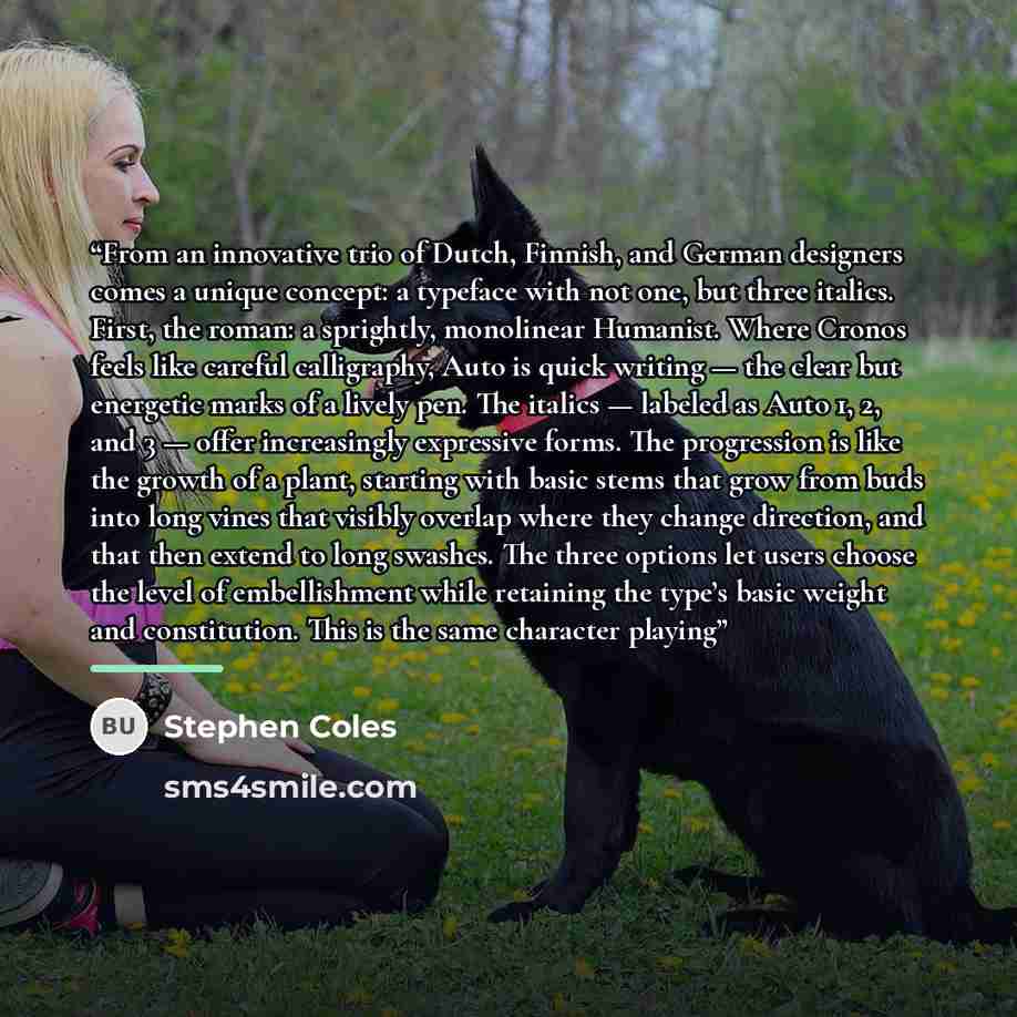
“From an innovative trio of Dutch, Finnish, and German designers comes a unique concept: a typeface with not one, but three italics.… — Stephen Coles Copy Share Image
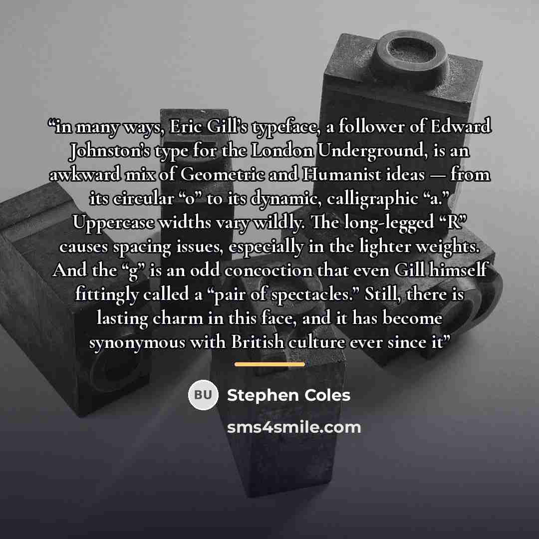
“in many ways, Eric Gill’s typeface, a follower of Edward Johnston’s type for the London Underground, is an awkward mix of Geometric… — Stephen Coles Copy Share Image
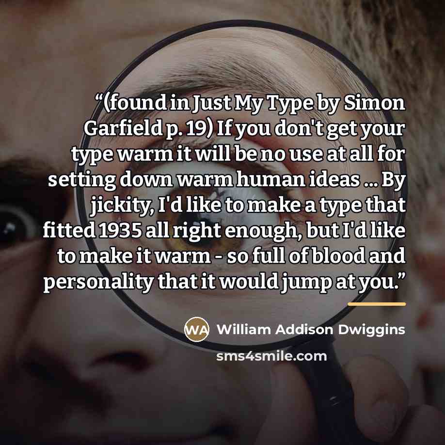
“(found in Just My Type by Simon Garfield p. 19) If you don't get your type warm it will be no use… — William Addison Dwiggins Copy Share Image
![“I don't think that type should be expressive at all. I can write the word 'dog' with any typeface and it doesn't have to look like a dog. But there are people that [think that] when they write 'dog' it should bark.” quote by Massimo Vignelli](https://sms4smile.com/quotes/img-quotes/4cf/massimo-vignelli-13401_bark_i-don-t-think-that-type-should-be-expres_762452.jpg)
![“One of my colleagues is convinced that having a wide range of types to choose from is a complete waste of time. He swears by two typefaces: Gill (1928) and Frutiger (1975), which he uses for road signs (among other things). (...) [U]ntil 1975, the year in which Adrian Frutiger's eponymous typeface…” quote by Anonymous](https://sms4smile.com/quotes/img-quotes/699/gerard-unger-104256_time_one-of-my-colleagues-is-convinced-that-h_897482.jpg)
![“However, [Edmund G. Gress] wrote, " we must not simplify to such an extent that life and movement are gone. That is where those persons go wrong who claim that type was made to read, and nothing else matters but the setting up of a paragraph in a legible type so that it can be easily read. We do…” quote by Steven Heller](https://sms4smile.com/quotes/img-quotes/769/steven-heller-45770_font_however-edmund-g-gress-wrote-we-must-not_1492313.jpg)