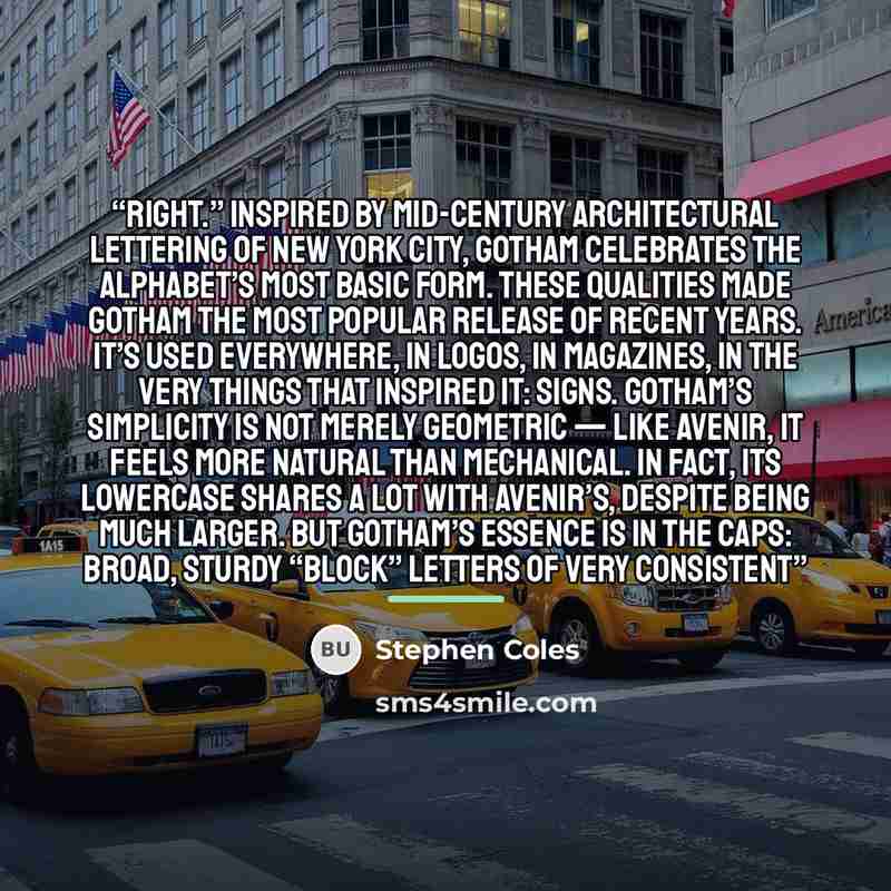
““right.” Inspired by mid-century architectural lettering of New York City, Gotham celebrates the alphabet’s most basic form. These qualities made Gotham the most popular release of recent years. It’s used everywhere, in logos, in magazines, in the very things that inspired it: signs. Gotham’s simplicity is not merely geometric — like Avenir, it feels more natural than mechanical. In fact, its lowercase shares a lot with Avenir’s, despite being much larger. But Gotham’s essence is in the caps: broad, sturdy “block” letters of very consistent””


![“With recidivism algorithms, for example, I worry about racist outcomes. With personality tests [for hiring], I worry about filtering out people with mental health problems from jobs. And with a teacher value-added model algorithm [used in New York City to score teachers], I worry literally that…” quote by Cathy O'Neil](https://sms4smile.com/quotes/img-quotes/7df/cathy-o-neil-11478_algorithms_with-recidivism-algorithms-for-example-i_18212.jpg)