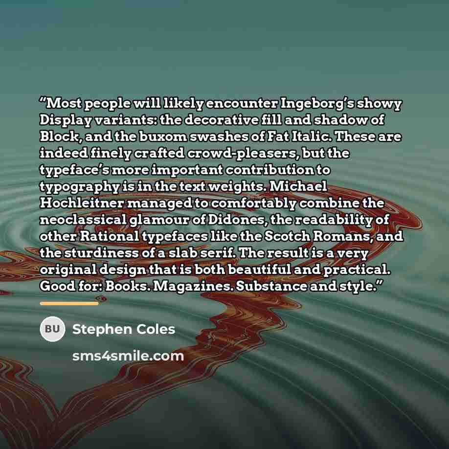
Old english Quote by Stephen Coles
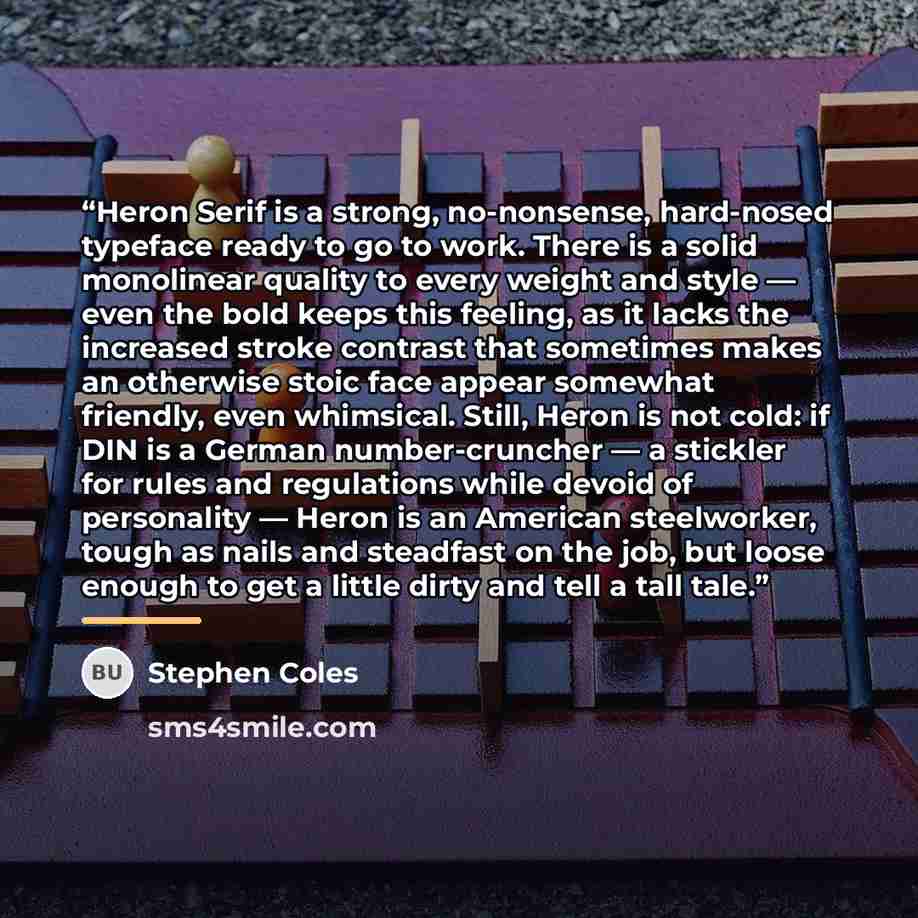
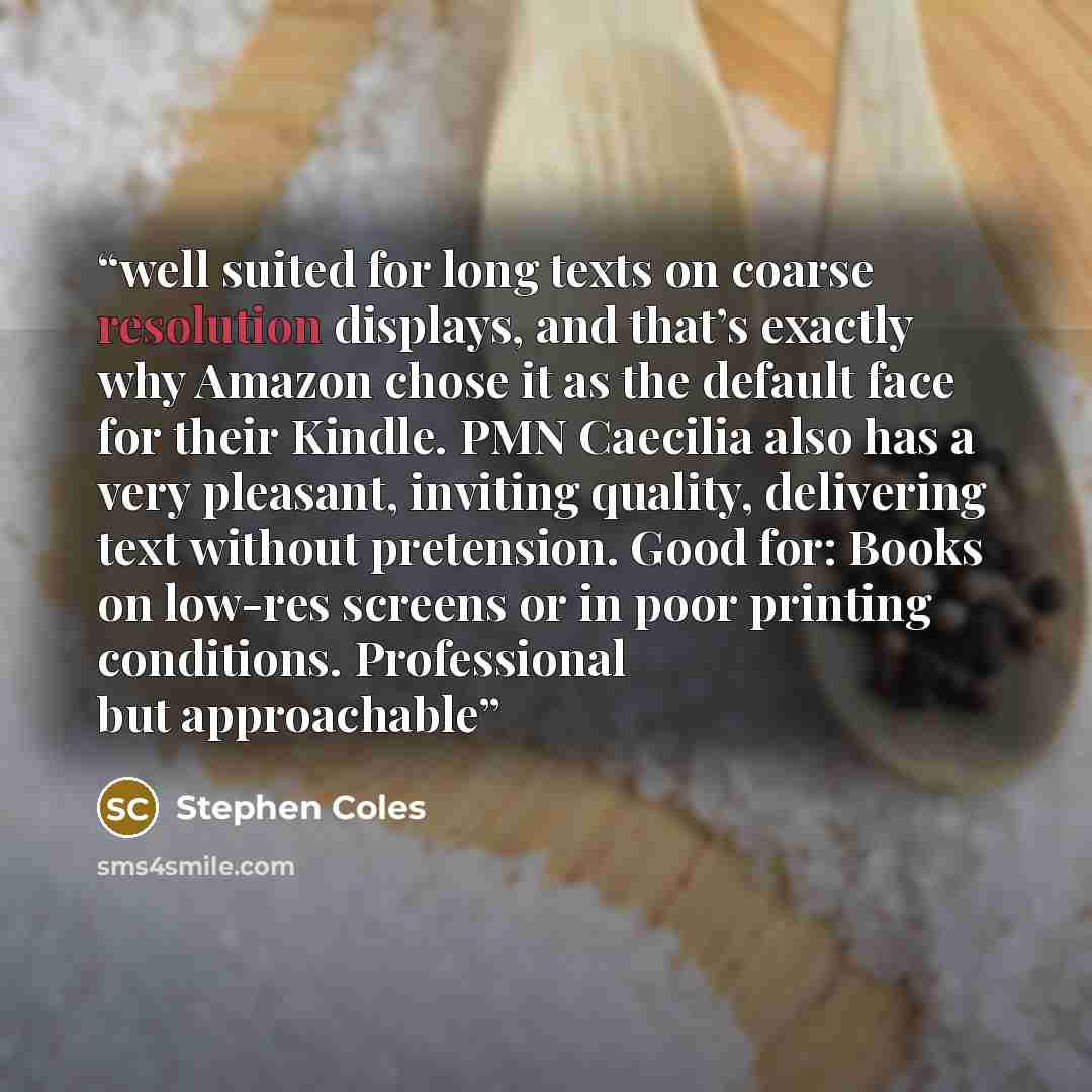
““blackletter has come to represent a certain reverence and antiquity. There are various forms, such as the French/Flemish Bâtarde, or the German Schwabacher and Fraktur, but the style familiar to most modern-day readers is Textura (colloquially — and inaccurately — called Old English). Yet most Textura typefaces still aren’t very legible to a public accustomed to roman letterforms. Cabazon alleviates that issue by keeping things fairly informal and free of ornamentation.””
About This Quote
Source Article: Typography History, Stephen Coles, 2023
Blackletter fonts convey historic gravitas but often lack readability for modern audiences; a simplified version improves legibility while retaining character.
In simple terms: Old‑style fonts feel historic but can be hard to read; simpler designs help.
Key Takeaway
Use clearer typefaces when readability matters.
Themes
legibility
history
design
readability
Mood
thoughtful
analytical
Type
explanatory
informative
When to use this quote
- publishing
- branding
- academic papers
- web design
- signage
Key Concepts
typography
visual communication
cultural heritage
Questions to Reflect On
- How can you balance tradition and clarity?
- When is ornate typography appropriate?
A Different Perspective
Simplified fonts may lose some authentic aesthetic.

![“I don't think that type should be expressive at all. I can write the word 'dog' with any typeface and it doesn't have to look like a dog. But there are people that [think that] when they write 'dog' it should bark.” quote by Massimo Vignelli](https://sms4smile.com/quotes/img-quotes/4cf/massimo-vignelli-13401_bark_i-don-t-think-that-type-should-be-expres_762452.jpg)
![“When I put my pen to a blank sheet, black isn’t added but rather the white sheet is deprived of light. [] Thus I also grasped that the empty spaces are the most important aspect of a typeface.” quote by Adrian Frutiger](https://sms4smile.com/quotes/img-quotes/35c/adrian-frutiger-47517_aspect_when-i-put-my-pen-to-a-blank-sheet-black_447077.jpg)




![“The practice of buying off the Vikings will always be associated with Æthelred in particular… [but] it was not something which proceeded from Æthelred alone, and indeed it was not uniquely characteristic of Æthelred’s reign… In 991 Ealdorman Byrhtnoth rejected the option of paying tribute and…” quote by Simon Keynes](https://sms4smile.com/quotes/img-quotes/349/simon-keynes-140423_anglo-saxon-history_the-practice-of-buying-off-the-vikings-w_71645.jpg)