Design Quote by Kyle Cooper
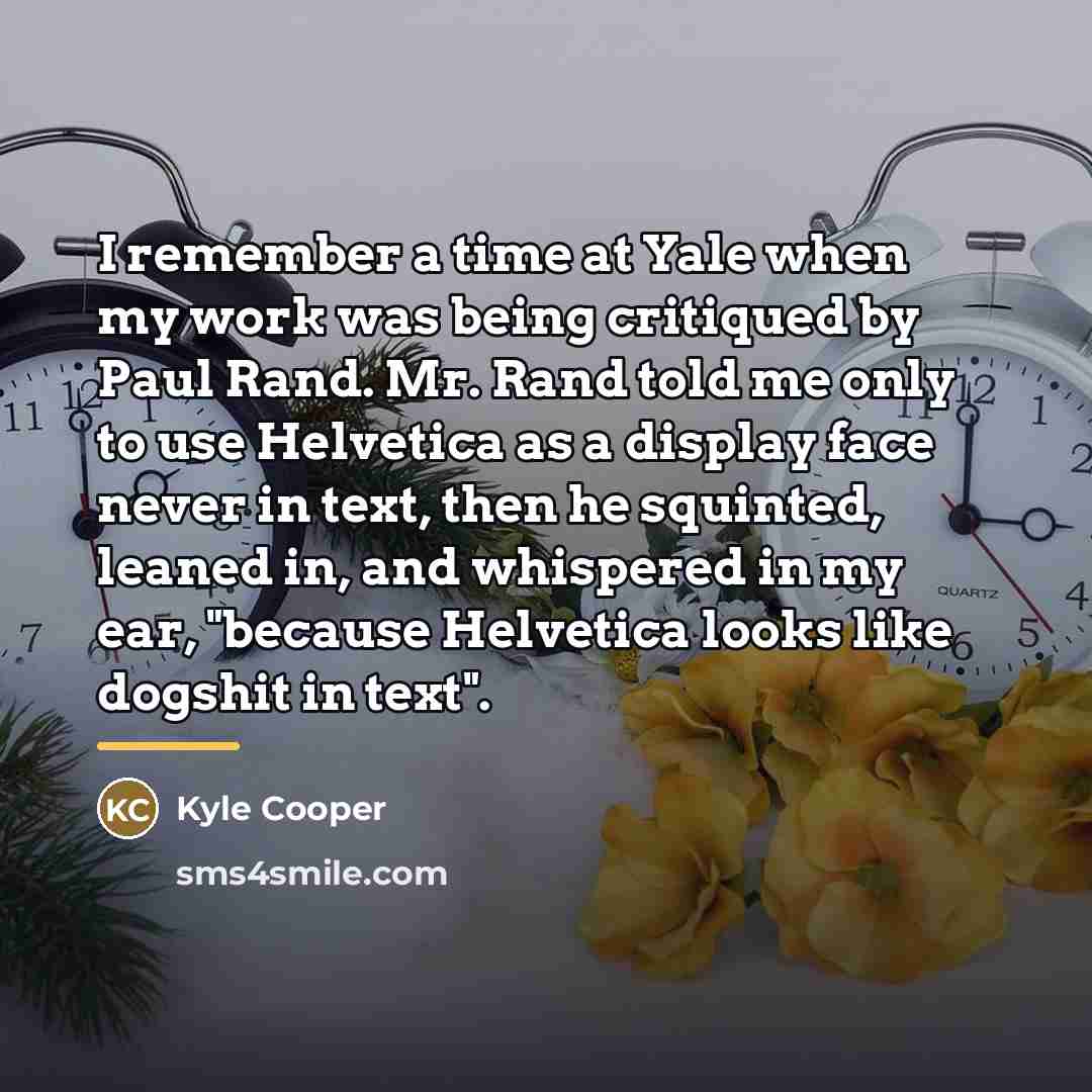
“I remember a time at Yale when my work was being critiqued by Paul Rand. Mr. Rand told me only to use Helvetica as a display face never in text, then he squinted, leaned in, and whispered in my ear, "because Helvetica looks like dogshit in text".”
About This Quote
Source Interview: Kyle Cooper discussing design with Paul Rand, date unknown
Design guidelines can be blunt; Helvetica is unsuitable for body text due to readability issues.
In simple terms: Helvetica bad for text.
Key Takeaway
Choose fonts appropriate for context.
Themes
design
typography
communication
clarity
Mood
critical
practical
Type
design
educational
When to use this quote
- branding projects
- website design
- print media
- UI design
Key Concepts
visual hierarchy
readability
design criticism
Questions to Reflect On
- When should you break typographic rules?
- How do you balance function and style?
A Different Perspective
Some designers may still prefer Helvetica for aesthetic reasons.