Adults Quote by Jan Tschichold
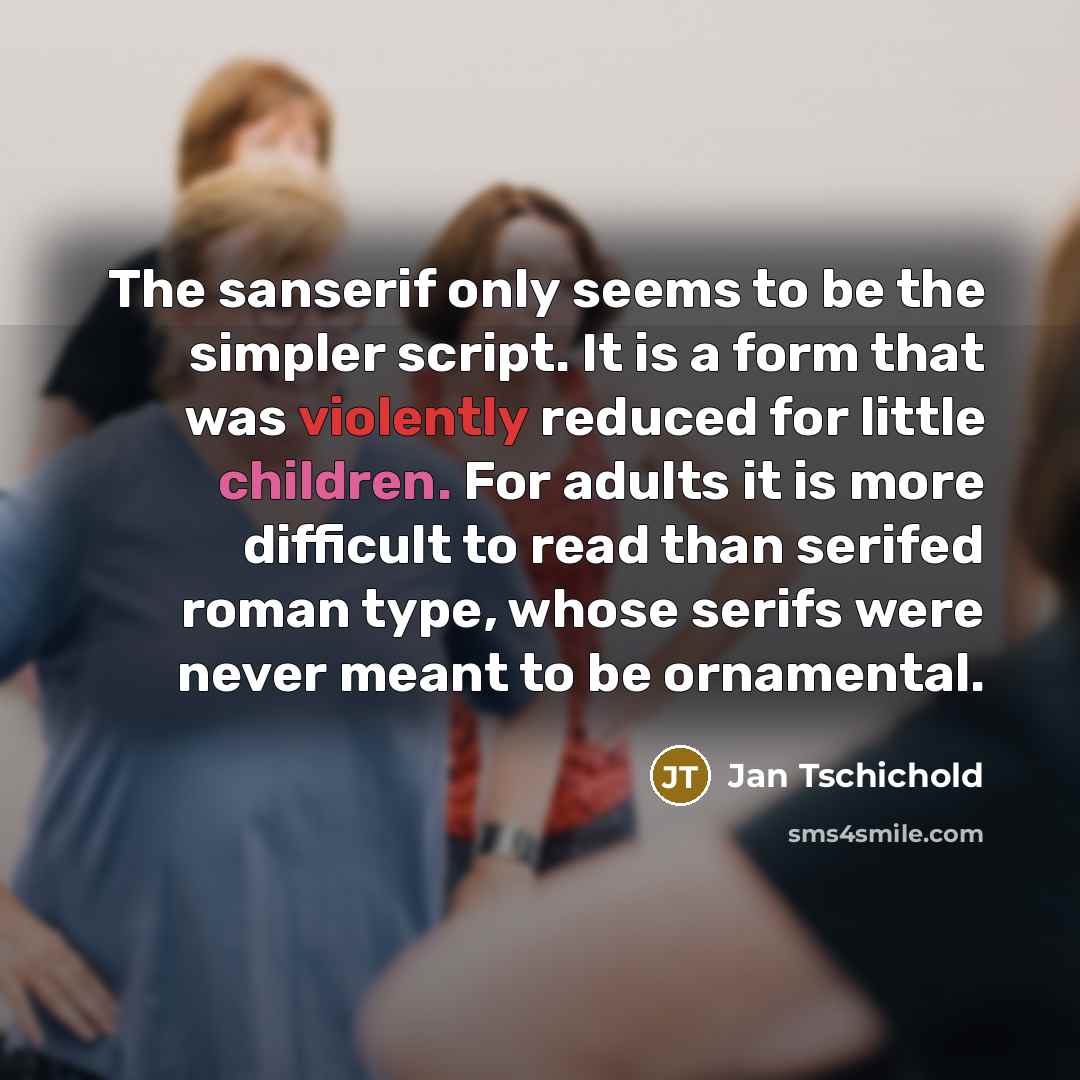
“The sanserif only seems to be the simpler script. It is a form that was violently reduced for little children. For adults it is more difficult to read than serifed roman type, whose serifs were never meant to be ornamental.”
About This Quote
Source Book: The New Typography, Jan Tschichold, 1932
Sans‑serif type appears simpler but was designed for children; adults find it harder to read than serif type, which had ornamental serifs.
In simple terms: Sans‑serif is deceptively simple.
Key Takeaway
Choose type based on audience.
Themes
design
typography
readability
audience
Mood
analytical
practical
Type
design
educational
When to use this quote
- graphic design
- education material
- branding
Key Concepts
visual hierarchy
cognitive load
historical design trends
Questions to Reflect On
- When is sans‑serif appropriate?
- How does age affect type preference?
A Different Perspective
May ignore modern legibility research.












![“He [an earnest young reporter] seemed to share the view of many intelligent, well-educated, well-meaning people that, while adult literature may aim to be art, the object of children's books is to whip the little rascals into shape.” quote by Katherine Paterson](https://sms4smile.com/quotes/img-quotes/2cf/katherine-paterson-2365_adults_he-an-earnest-young-reporter-seemed-to-s_6101.jpg)